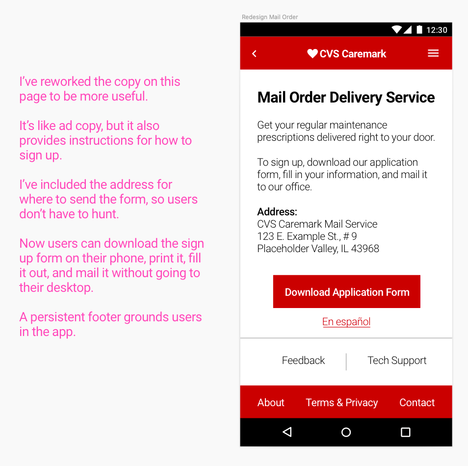

*This is spec work.
CVS Caremark Mobile App
Following personal frustrations I experienced signing up to get prescriptions in the mail, I decided to use it as an opportunity to redesign the CVS Caremark mobile app to improve my skills and make a better experience.
Recreating the Experience
I recreated the app structure using Sketch and annotated the screens with opportunities.
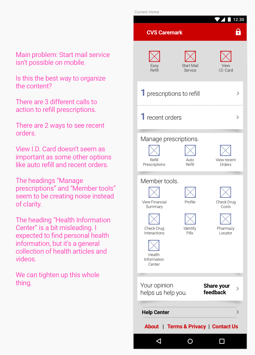
Recreation of the app's home screen (as of 2019)
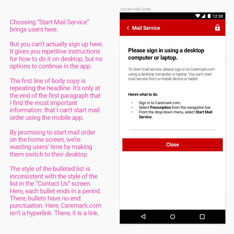
Recreation of the app's "Start Mail Service" screen (as of 2019)
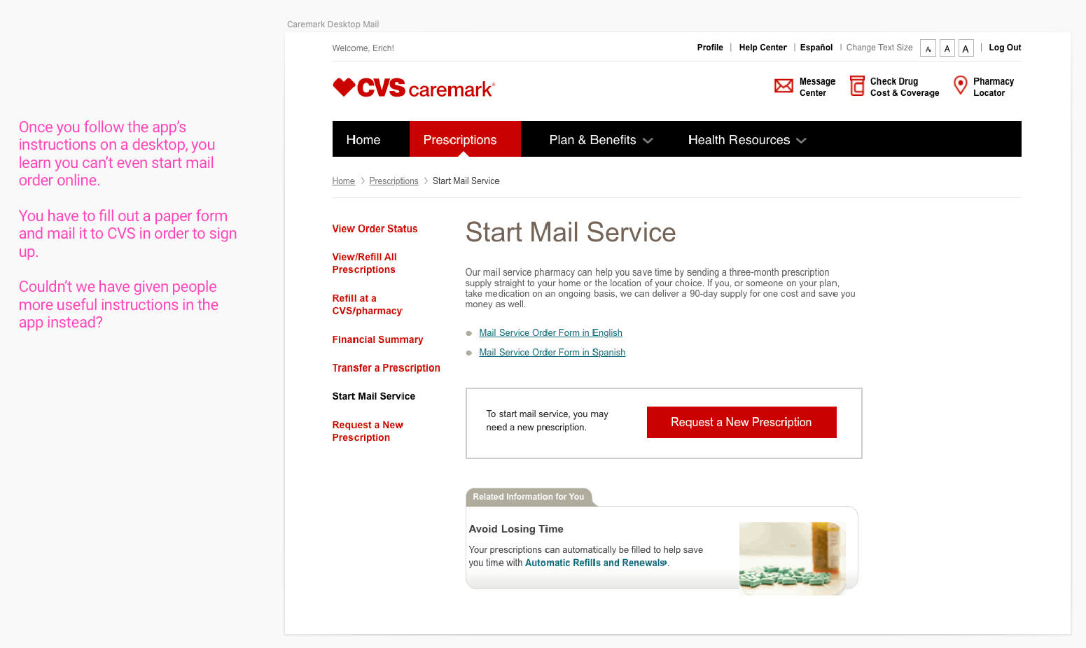
Supporting screenshot of the desktop website (as of 2019)
Redesign and New Information Architecture
After auditing the current experience, I was able to cut 8 options from the home screen. The redesigned home screen prioritizes the most important options, groups similar options, and features a new menu for tertiary tools.
The enhancements reduce or eliminate potential frustrations trying to sign up for mail order.
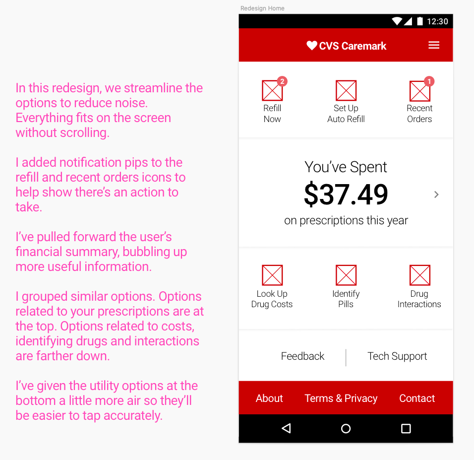
Redesigned home screen features no-scroll design
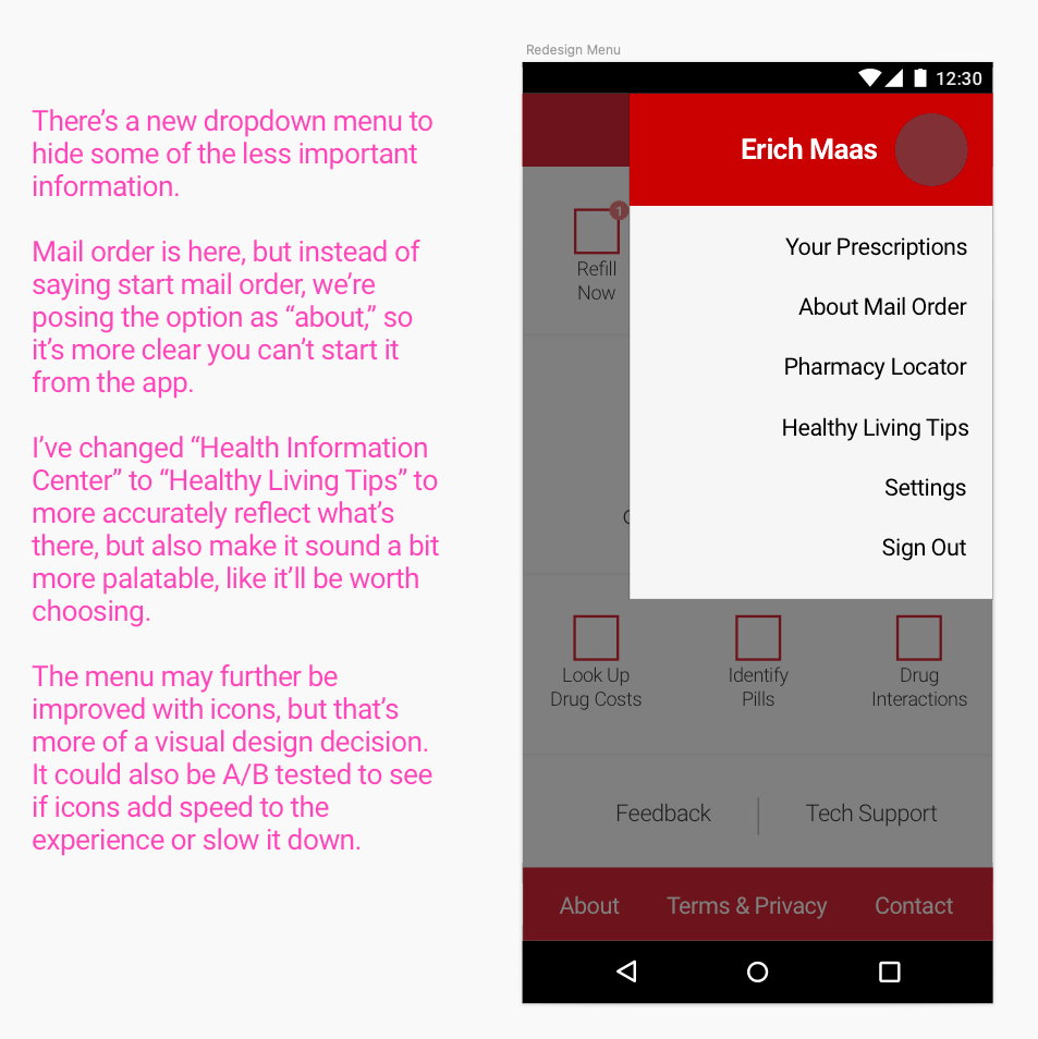
New menu contains tertiary tools for a cleaner home screen