Content Design Case Studies
I led content design on more than a dozen priority projects. These are some highlights.
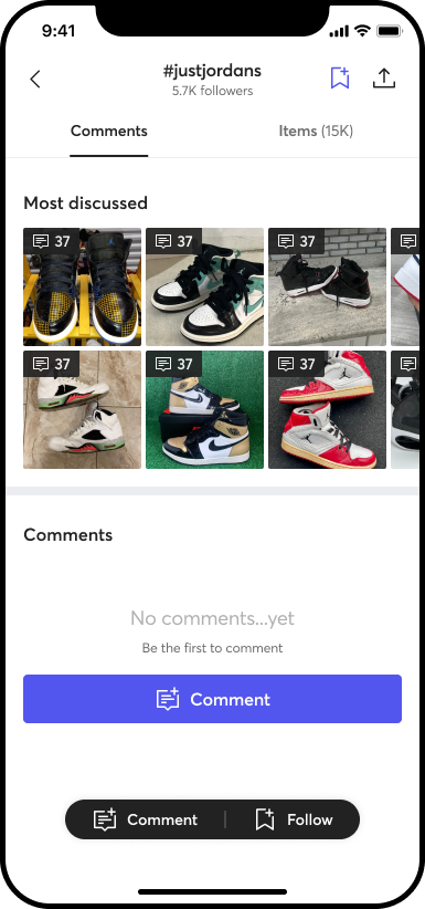
Community Group Page Empty State
TL;DR: As a follow up to enabling public comments on community group pages, I created 43 variants to dynamically swap out on page load for group page empty states.
Partners: UX design, Product management
Background:
The company wanted to jumpstart comments in new community group pages we built. There were thousands of these empty groups, and we were getting a few comments, but most pages were totally blank. And the comments we did get weren't that valuable. It was things like "Hi." and "I have items for sale."
The hypothesis was that people might just not know what types of things to comment about. They might have things to say, but they don't know that this is the right place to say them — since this was a new idea to the platform.
This project also intersected with a new brand direction that was just launching, so this was one of the first times that brand would come to life on the platform.
Execution:
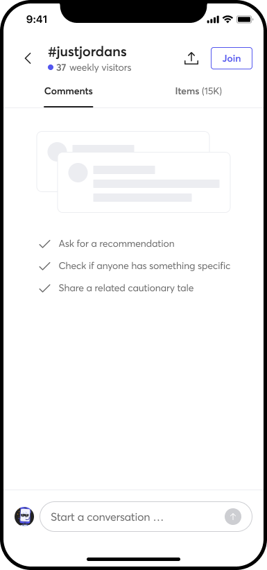
The expectation from the project brief was just to tweak the existing empty state to nod to some of the use cases for comments. It shouldn't have been all that interesting of a project. And for a few days, it wasn't. I worked with my design partner to create a minimal, static option that would satisfy the brief.
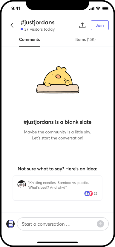
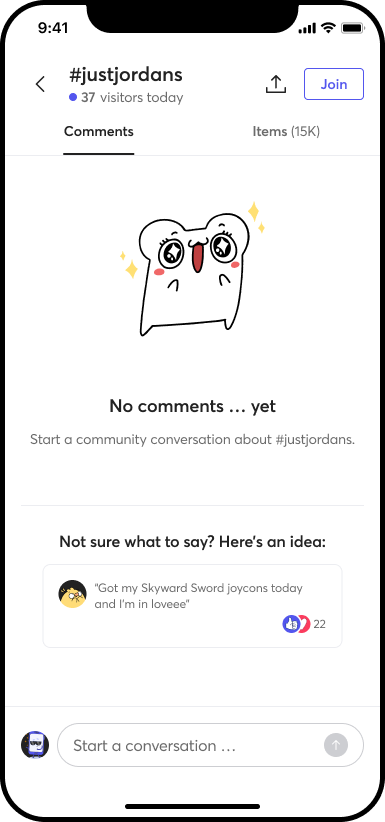
Original empty state (left). Minimal, static update (right).
But I had another idea.
I took inspiration from long video game loading screens, where there's a rotating tip about the game world to deepen your knowledge of the lore while you're not even playing. And there's usually a visual component to it that keeps the loading screen somewhat interesting. You stay a little bit engaged.
Surely there was something similar we could do here.
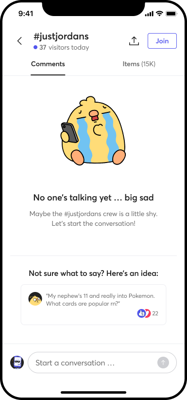
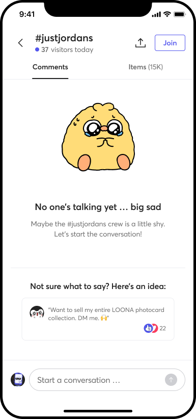
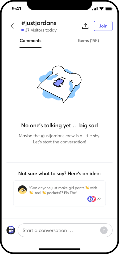
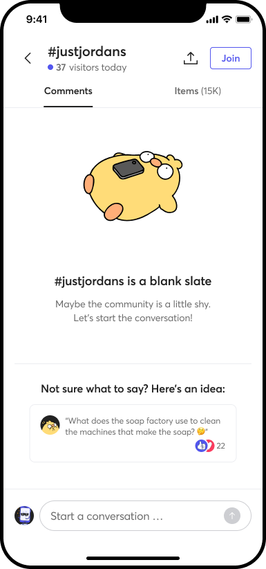
I proposed a dynamic empty state with dozens of variants that would rotate on page load. Each time you visited a new community page (or the same one again), you'd get a different empty state with different copy and a different illustration from our new brand library.
What kind of copy? An example comment. If the idea worked in testing, eventually we'd use real comments from real community pages. But since the idea was untested and there weren't a lot of comments to choose from, I wrote them myself.
This is perhaps the best example of how I've applied divergent thinking in my career. I took inspiration from fandoms of all sorts. I came up with questions, and statements, even a Batman joke. All types of things that people might say on the platform — to show people that these spaces can be whatever you need them to be. They're yours.
6 (of 43) empty state variants:
Extending the value:
What happens when someone leaves the first comment? Normally an empty state would go away, and all the value of this feature would be lost. To retain and extend its value, we proposed a "not empty" state as well that would include the same dynamic examples in a subtle way to keep providing comment inspiration no matter how many comments had already been left.
Metric:
The product manager was as excited about this idea as I was. Unfortunately we never got a chance to test it because the entire community product area was deprioritized as soon as handoff for this was made.
"Check Out" CTA
TL;DR: Changing copy on 1 CTA increased buy conversion by 1% (statistically significant).
Partners: Product management
This isn't a sexy project, or a big project — but it made a big difference — and it came down to 1 button.
Background:
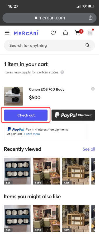
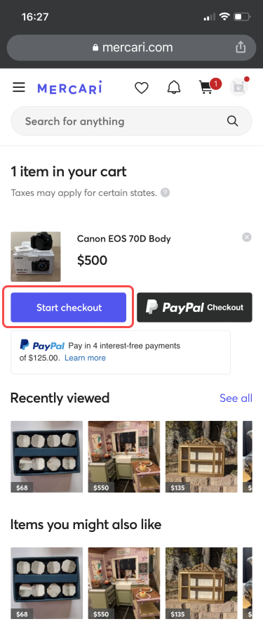
I was buying something on the platform. Something with the call to action on the "Cart" page stuck out. The CTA was "Buy now," and something about it was making me pause.
I didn't know what was going to happen next. There was a sense of finality to it. It gave me mild anxiety.
I had questions: Would my card be charged immediately? How much was tax? Was my address right?
It turns out "Buy now" triggered the normal checkout flow where you get to confirm all the details before you'd be charged, but it wasn't clear from the copy — and my hypothesis was a lot of users might feel the same way.
Execution:
I mocked up a quick multi-variant test in Figma and sent it to the product manager for that area. He loved a quick test like this. We tested "Check out," "Go to checkout," and "Start checkout" against the control.
Metric:
It turned out my personal favorite "Check out" achieved a 0.9% increase in buy conversion — statistically significant. Based on the sample size, that's about 8,000 more orders completed than the control over the course of a just a few days. Assuming a conservative average order value of $30, that's almost a quarter of a million dollars. The product manager released this variant across all platforms.
Underpaid Shipping Recoup
TL;DR: Through content and UI design, my working team saved the company over $1M annually.
Partners: UX design, Product management, Legal & Compliance
Background:
Mercari was covering the cost of an exploit some sellers used to ship heavy items with inexpensive labels meant for lightweight items through FedEx and UPS.
The UX brief asked us to develop a way to recoup that cost from those sellers, and help sellers avoid getting their shipping prices wrong.
Execution:
Part 1: In partnership with a UX designer, I created a user flow to help people get the right shipping label in the first place.
Shipping can be complex on Mercari. Users have a lot working against them to get it right. It's because you have to choose your shipping label during the listing process. It's based on the weight and size of the package. But most people don't have their item packaged when they list it. A lot of people don't even have parcel scales to weigh them with. Prices can be different if the package isn't heavy but is very large. And there's no simple way to adjust your shipping label once an item sells … In short, shipping is tricky.
I addressed these issues by making the subtle clues about measuring the fully packed item we had in place already a bit less subtle. Dimensions of the package come into play for FedEx and UPS only, so the proposed solution was to only ask for dimensions after a user selected one of those carriers — and I used this moment as another opportunity to explain why we needed that information.
The way that dimensions come into play is called "dimensional weight" — a bit of shipping carrier jargon that doesn't make intuitive sense unless you've dealt with it a bunch. So I used that jargon sparingly and explained it with tooltips and other executions when it did come up.
Part 2: Next we developed a flow to charge sellers who underpaid for shipping the correct amount post-purchase.
The key here was to make it clear what happened, what the cost to the seller was now, and how to avoid it in the future. This is a very real point of frustration for people. No one likes to be charged money — especially when it affects the amount you earn from a sale.
I flexed my empathy muscles here by proposing we build in a warning for first time underpaid sellers. Instead of charging them what could be a large amount, we'd explain what happened and cover the charge for them this time, and show how to avoid a charge next time.
Limitations:
I'll admit, it's still not the most ideal execution. Scope limitations kept us from exploring a way for users to adjust shipping labels at the point of sale, rather than at the point of listing. If users could pick their label just before shipping, they'd have the package ready to measure, and it's a lot easier to get it right.
Unfortunately the project we proposed to adjust shipping labels post-purchase never got prioritized, so we may never know how that might improve things further for users or the business.
Metric:
The result is $1M in annual savings to the company.
Ontology mapping
Background
It's difficult to imagine big, new concepts fitting into existing platforms, especially when the ecosystem is already large and there are a lot of touchpoints in play.
My working team was tasked with designing a suite of community-development features for our users. There were a lot of approaches we could take, and our decisions at one part of the flow could change the options we had at the far end of the user journey.
To be able to understand our options and the effects of each choice, I developed a practice we would go on to call ontology mapping.
I used the idea of a switchboard or circuit diagram from electrical engineering and applied elements of process diagramming, ecosystem mapping, and relationship mapping to create a comprehensive look at all of our options and how they connected to each other and the existing experience.
Thinking of decisions like switches that could be on or off helped us see what effects turning an idea on or off might have farther along in the circuit — in other words, what might a particular idea unlock?
Execution
I started with an inventory and audit of the existing experience — a map of the whole product ecosystem — so we could see where the proposed new community features could fit in.
I did this inventory and audit in partnership with a user researcher and experience designer. We sat together (remotely), and documented an abstracted map of Mercari, each taking a different platform (desktop, mobile web, and mobile app) so we could note any nuances between platforms more efficiently. Along the way, we noted pain points with the current experience and questions to follow up with engineering about how things worked or why they worked that way.
With this map, we could see at a glance which features were connected and where pain points were highly concentrated. We could also see just how complicated certain ares of the experience were, such as performing a search.
Then we mapped out "switches" for new features. An example is user moderation of communities. We documented how that might look in our map if we allowed it, and where it might fit in. If there were several options available for how we might allow it, we document each separately, so we could see pros and cons of each approach clearly.
Lastly, we packaged it into a more digestible format that we could use to present the approaches, and that stakeholders could follow on their own.
Result
Our product manager used the pain points we mapped out in the existing experience to create a series of user stories for engineering to pick up and fix immediately. The PM used the ontology map directly to create project briefs, and we were able to address every pain point we identified before we even started on the new features.
The PM then created briefs for new features using our proposed approaches.
Ultimately this process helped us efficiently scope out these project and left minimal room for surprises or scope bloat as we dug in.
Brand development
Brand attributes and principles
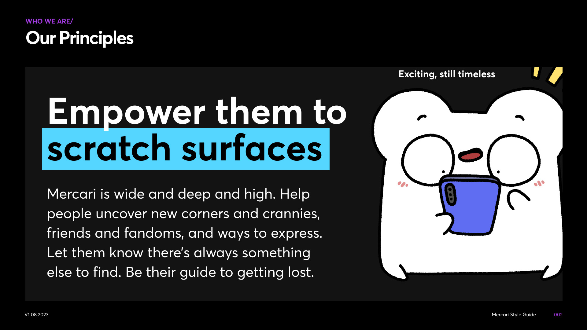
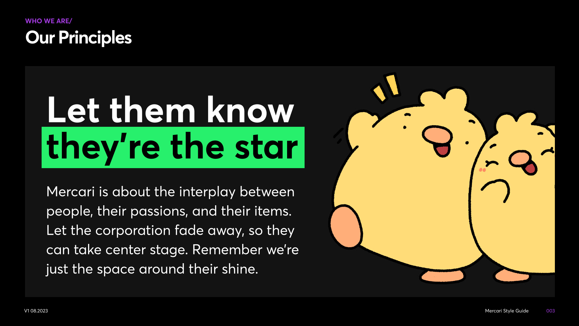
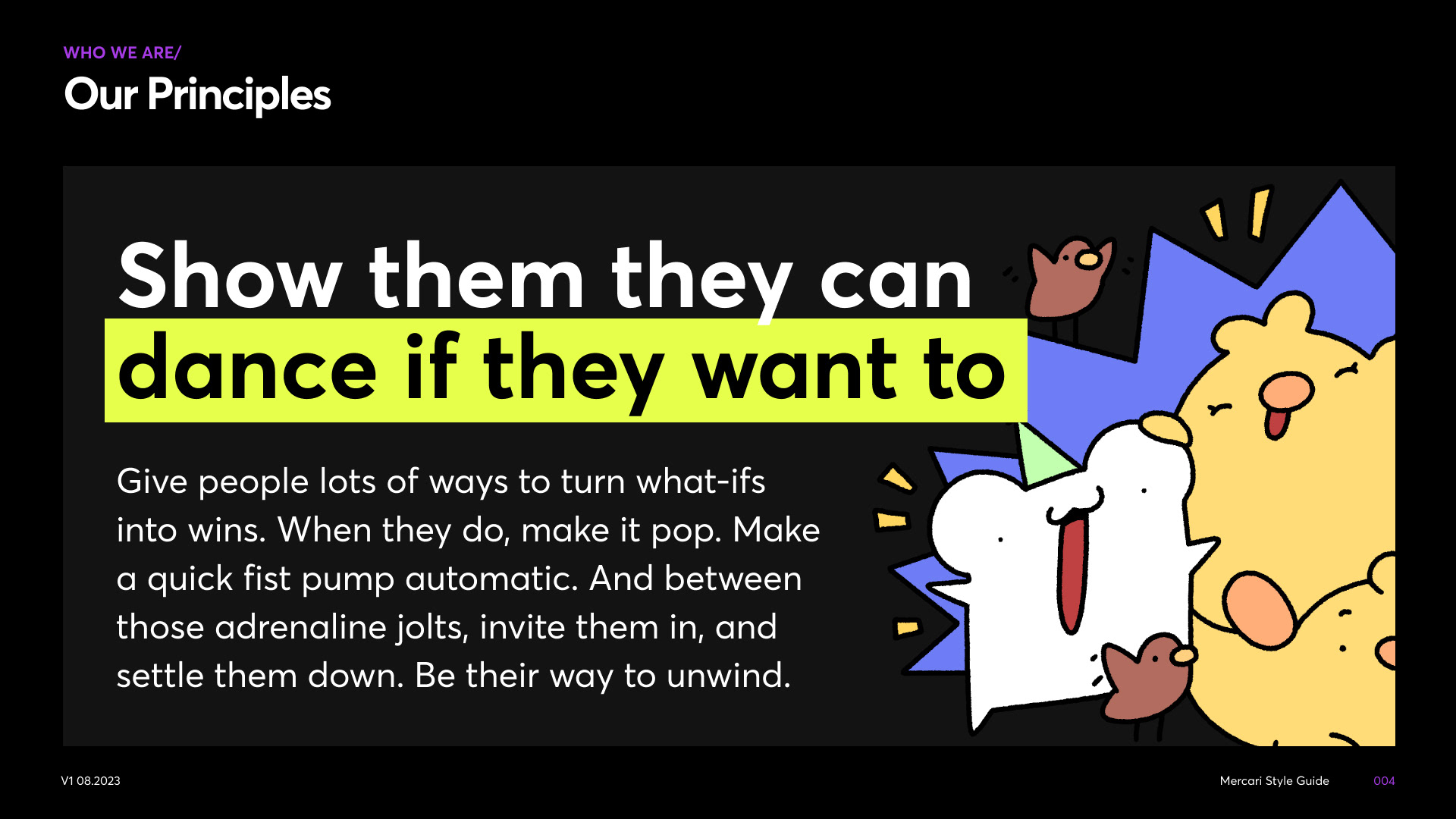
I led the development of brand attributes (in other words, what is Mercari?) and principles (in other words, what does Mercari do?) for a new brand direction, engaging cross-functional stakeholders as high as 3 steps above me in the organizational structure.
Highlights:
I planned and facilitated 3 workshops with different groups of cross-functional partners (Marketing + Brand, UX Design + UX Content, Product Management, Legal + Compliance + Customer Operations) to learn about what we collectively perceived our current attributes to be, which if any we didn't want to hold on to, and which others we might aspire to going forward.
I modeled my workshops after the game show "Game Changer" (from Dropout) as a gimmick to break the ice with participants and make the workshops engaging.
With everyone's input, I synthesized the results and created a set of 3 aspirational (yet achievable) attributes. I then used those attributes to inform 3 principles. I intended them to be usable by anyone in the company to help make decisions, regardless of their discipline.
The director of UX and Brand revealed them at a company all hands, and seeing the Google Meet reactions flooding the screen as he talked through them was one of my proudest moments.
Naming the "Confetti"
Another contribution I made to the new brand direction was naming the little tilted square in the Mercari logo. Forever known as "the tittle," we wanted a new way to describe that motif since the new brand direction featured it much more often and more prominently.
After some back and forth brainstorming in Slack, the best we'd come up with was "the Box" to represent the packages being shipped through the platform.
Then, the idea hit me …
So, "Confetti" it was. To reflect the feeling of opening a package, or making your first sale. The name even influenced some of how the motif was used.
Content system
Building an enterprise style guide
Having developed a number of style guides in my career, I've developed a pretty foolproof and efficient process.
Making the case
Part of the reason I was hired was to help build a style guide and content system (a set of reusable patterns of content). So part of the case was made for me.
But what exactly is the scope of it? That remained for me to uncover. Clicking or tapping through a product is a great way to spot inconsistencies in language and lexicon. After working on a few projects, I had a list of rules to decide on and guidelines to make.
I'd implemented the Writer tool at another company, and suspected it would work well here, too. I asked around and found that anecdotally designers and engineers would also love a tool like that if we had one. So I pitched it to management, and after some initial hesitation, got through and we started contract negotiation.
Creating the workflow
Part of making any style guide successful is making sure you have the right people involved. It's easy to have several siloed teams creating their own style guides that duplicate — or even conflict with — one another.
I established a style council to help reduce that. I invited representatives from content disciplines across the company — UX, marketing, CRM — to join a weekly style council meeting to discuss content guidelines and make decisions about how we should approach things as a whole, not as siloed teams.
There are a lot of ways to document and work through a list of style guidelines you want to make. We used Jira, since that's what we were using for regular project work already. I worked with our program manager to build an epic and a user story template to document all the content system work.
Once we made decisions about a guideline together, one of us volunteered to pick that up and write the guideline that would appear in our style guide — housed on an internal website.
When we had enough guidelines fleshed out, the site was ready to launch.
Content system release
The first phase of the content system was a website of guidelines and product terminology all our content creators could reference. From there, we could add those guidelines that were already created and in use to the Writer tool, and they would begin to show up in the workflows of writers, designers, and engineers where they were working.